1. Example Jupyter R notebook#
Jupyter is a web application that presents notebooks (like this).
1.1. Example cell#
The notebook is divided into “cells” that can be tagged for Markdown or Code (dropdown above).
Double-click to edit a cell.
Shift-enter to evaluate the cell.
Jupyter sends the contents of the cell back to a “Kernel” running on the server to evaluate.
If there is output, it’s displayed below the cell.
1.2. You can preload data and libraries#
For example, there are preloaded datasets in jacobs2016data:
class.datafeedback.topicslecturer.scoresmodule.scoresstudent.demographics
# working dir for data
setwd("jacobs2016data")
getwd()
‘/media/home_nfs_import/home_iagpu/pers/marc.buffat/JupyterAI/jacobs2016data’
# Load the data
#library(jacobs2016data)
data(class.data)
data(student.demographics)
data(lecturer.scores)
data(module.scores)
data(feedback.topics)
1.3. This is just like Rserve, but with a GUI#
So you send a command and get back standard out
class.data
| year | students | gtas | mean.marks |
|---|---|---|---|
| <int> | <dbl> | <dbl> | <dbl> |
| 2010 | 35 | 4 | 0.505 |
| 2011 | 89 | 7 | 0.689 |
| 2012 | 162 | 9 | 0.603 |
| 2013 | 85 | 18 | 0.745 |
| 2014 | 87 | 14 | 0.680 |
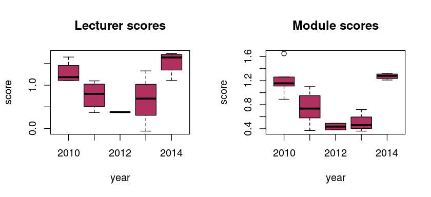
options(repr.plot.width=7, repr.plot.height=3.2)  # fit in browser display
par(mfrow=c(1,2))
boxplot(score~year, data=lecturer.scores, col="maroon", main="Lecturer scores")
boxplot(score~year, data=module.scores, col="maroon", main="Module scores")
par(mfrow=c(1,1))
1.4. You can preload popular libraries#
The ones available via Anaconda are here – but you don’t need Anaconda to install R on Docker, it’s just easier, and you don’t need to use Anaconda to install other R packages when you start with the Anaconda distribution.
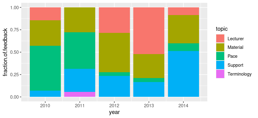
# names(feedback.topics) --> 'year' 'topic' 'fraction.of.feedback'
library(ggplot2)
ggplot(feedback.topics, aes(x = year, y = fraction.of.feedback, fill = topic)) +
  geom_bar(stat = 'identity', position = 'stack')
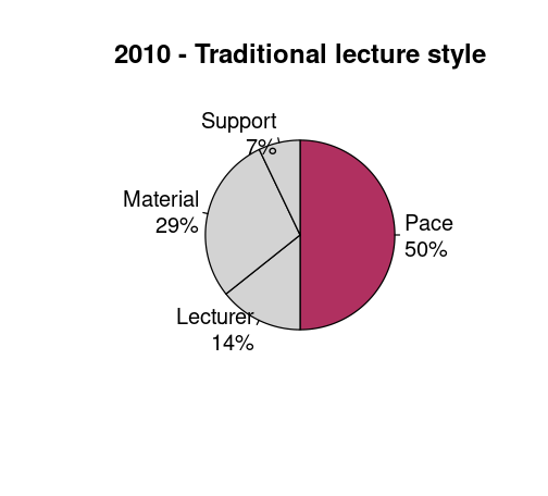
1.5. Students can immediately alter functions and try things on their own#
So you can present them with functions and let them modify them … and realistically alternate Theory → Worked example → Hands-on in class. (Or in a tutorial / demo at a conference).
options(repr.plot.width=4.2, repr.plot.height=3.8)
class_year = 2010

show.feedback <- function(year, highlight, methodology) {
    df = feedback.topics[feedback.topics$year == year,]
    pie(df$fraction.of.feedback,
        labels=sprintf('%s\n%d%%', df$topic, round(df$fraction.of.feedback*100)),
        clockwise=T,
        col=ifelse(df$topic %in% highlight, 'maroon', 'lightgray'),
        main=sprintf('%d - %s',year, methodology))
}
show.feedback(2010, c('Pace'), 'Traditional lecture style')
#show.feedback(2011, c('Pace', 'Support'), '3 extra hours of lab')
#show.feedback(2012, c('Lecturer', 'Material'), 'YouTube videos + in-class work')
#show.feedback(2013, c('Lecturer', 'Support'), 'Written lecture notes + in-class work')
#show.feedback(2014, c('Support'), '10-min. lectures + sticky notes + in-class work')
2. Aside notes#
By the way, yes Jupyter can present LaTeX markup (between $$ symbols – using the MathJax javascript library):
2.1. References#
C. T. Jacobs, G. J. Gorman, H. E. Rees, L. E. Craig (In Press). Experiences with efficient methodologies for teaching computer programming to geoscientists. Journal of Geoscience Education. Pre-print: http://arxiv.org/abs/1505.05425
IRKernel: https://irkernel.github.io/
Jupyter: http://jupyter.org/
Jupyter’s GitHub repositories
for tmpnb (no authentication; temporary notebooks)
for JupyterHub (login-authenticated; one account per user on the system)
for the Dockerfile that makes their default Jupyter+R installation
Docker: https://www.docker.com/